What truly makes or breaks a home at the end of the day is the furniture that’s placed in it. The right kind of furniture design can create the essence and soul of a home. And I do feel it’s essential that the soul of our home is a reflection of our own soul. Hence picking furniture pieces that bring out the best in our homes, while authentically representing our personality is a must. You need to pick designs that are fun, sophisticated, and functional. And we came across a couple of excellent designs in 2022! They will add an extra spark to your home, without compromising on utility and functionality in the least. From a unique bookshelf that doubles up as a side table to a coffin-inspired office chair – these intriguing furniture designs are what your modern home needs in 2023.
1. Coffin Office Chair
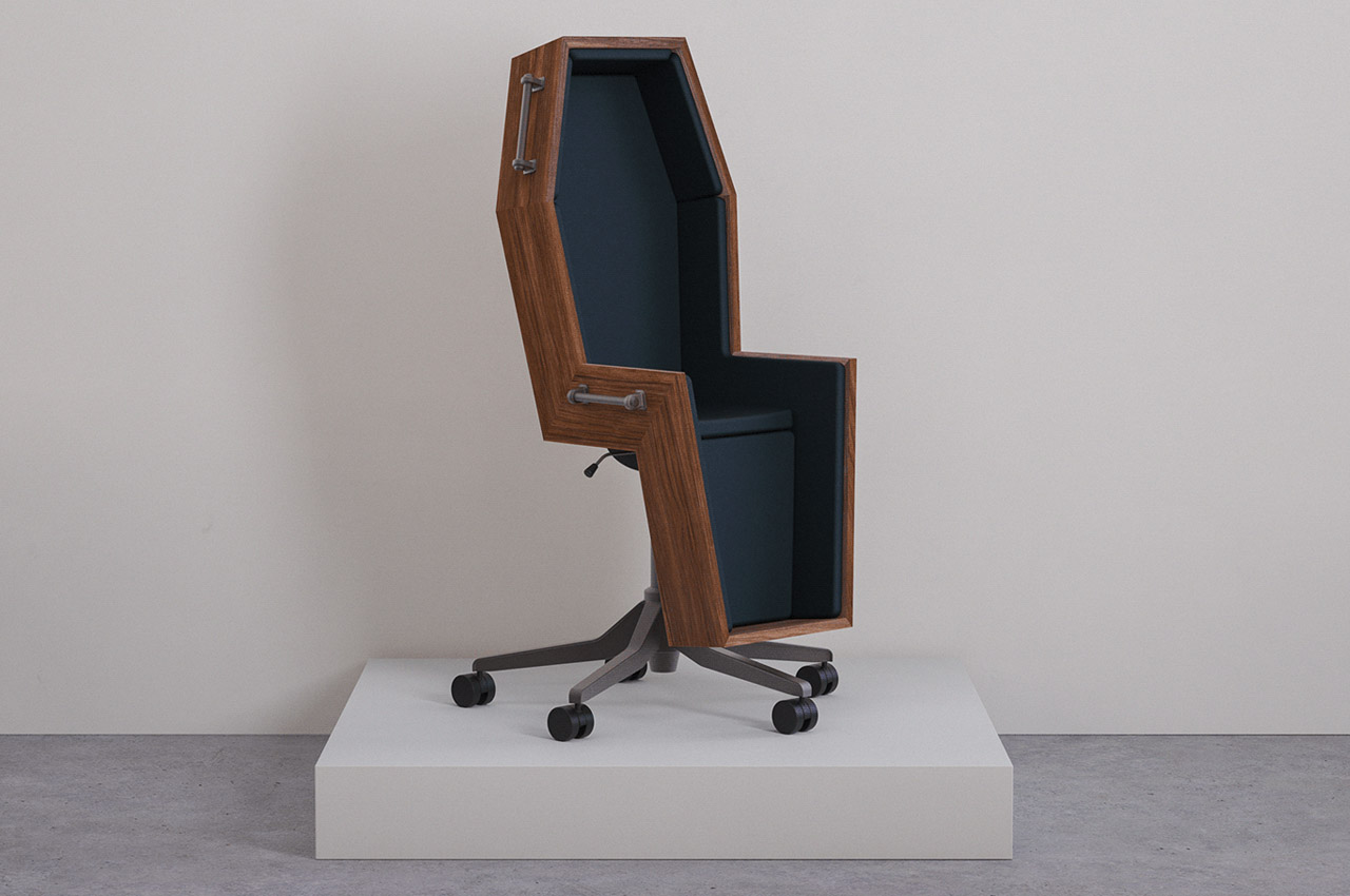

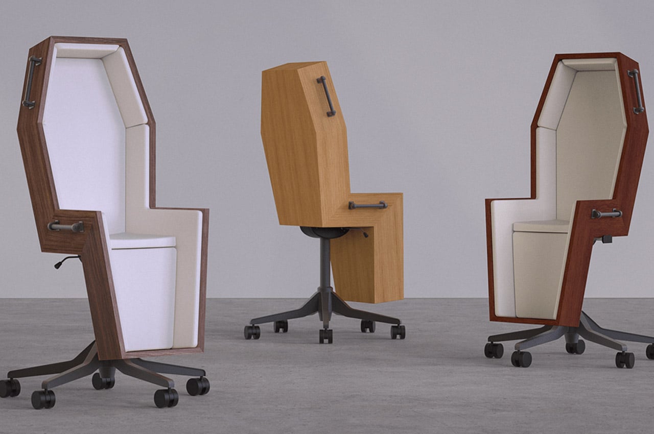
Are you someone who absolutely despises your dead-end corporate job, well then, we may have found the chair for you! Shaped like a coffin, this wooden chair recently took the internet by storm. A Twitter user shared it on September 7th, and everyone who’s downright fed up with their jobs wholly resonated with it.
Why is it noteworthy?
The conceptual coffin chair perfectly represents all the dreaded emotions employees feel throughout their workday. It reflects the feeling of doom one experiences, as they have to sit through another pointless meeting that could have been an email.
What we like
- Inspired by Rene Magritte’s painting titled The Balcony (1950)
- Perfectly captures the feeling of having a dead-end job
What we dislike
- It’s a concept!
- There’s no cozy cushioning to get comfy in
2. The Bookgroove
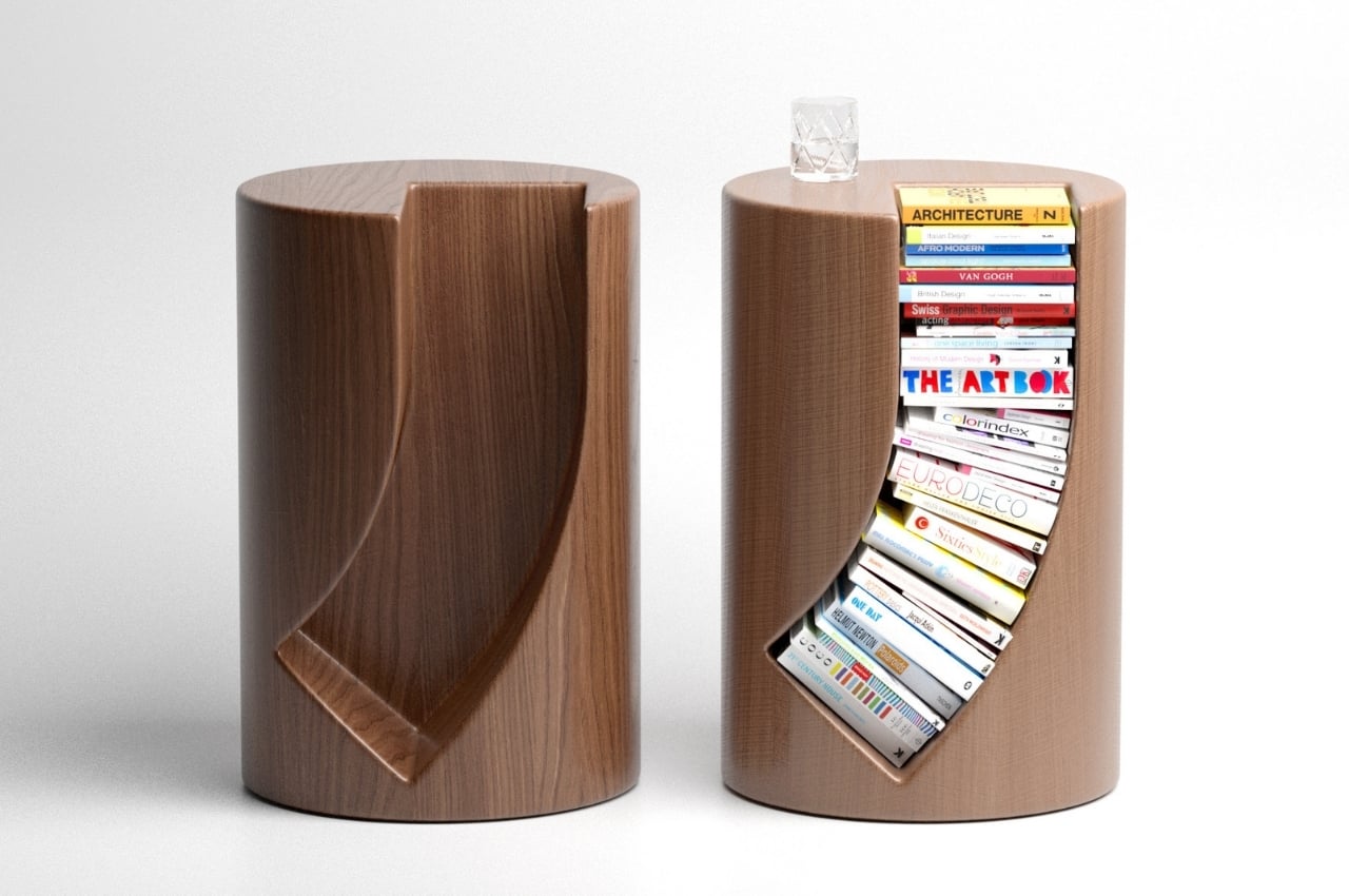
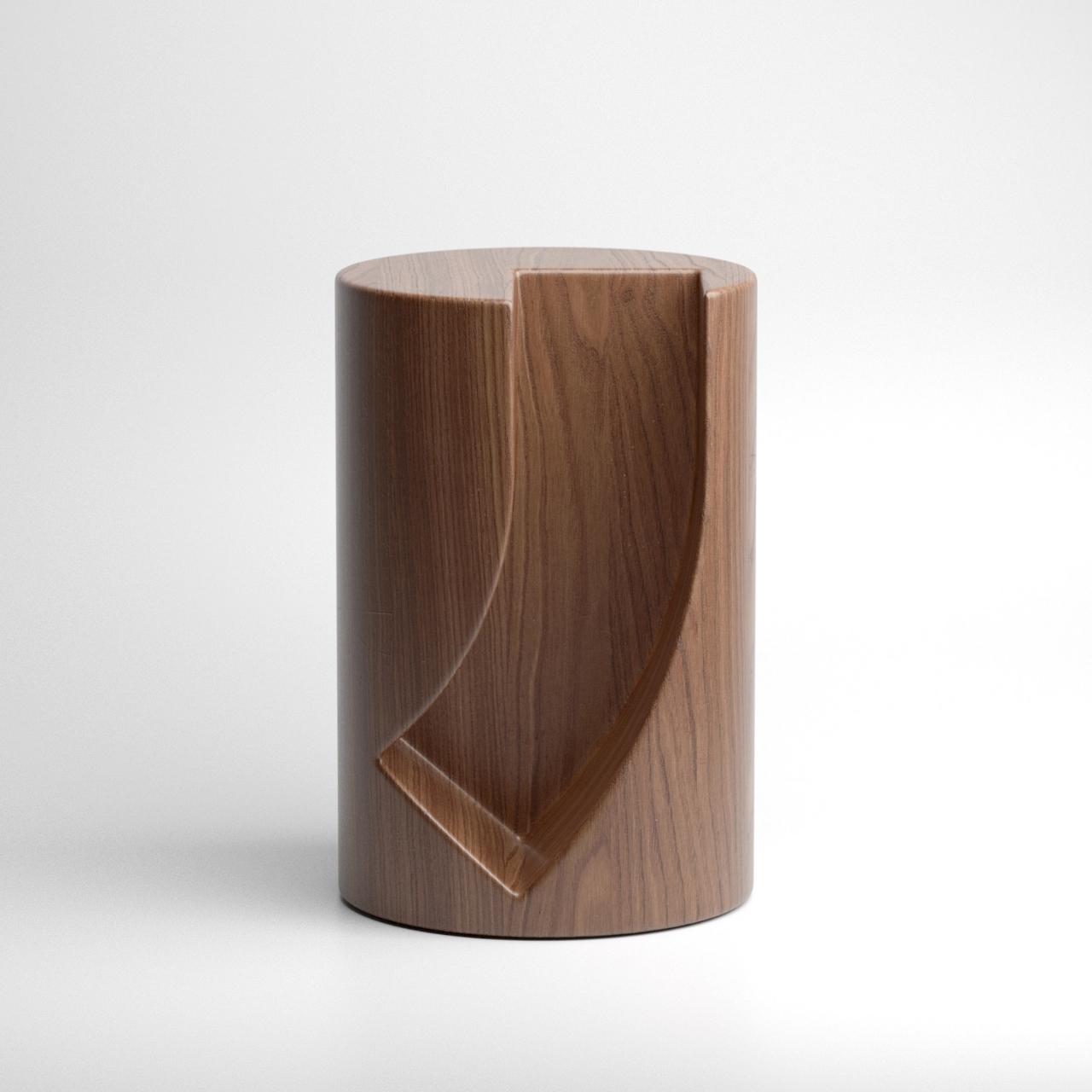
We’re seeing a lot of product concepts for tables, shelves, and sideboards that can house books so designers need to create something that will stand out. And one such design is Bookgroove. The Bookgroove is a bookrack and table in one that has a pretty unique shape.
Why is it noteworthy?
The table itself is circular at first glance but there’s an almost J-shaped carving on one side that can fit several books. It’s not the most usual way to store books as they have to follow the shape of the built-in shelf on the side table
What we like
- You can place a cup of coffee or glass of wine on the top part
- It’s a fun way to store your favorite books
What we dislike
- The books that will be at the bottom of the curve may get damaged over time because of their positioning
- It’s also probably difficult to get some of the books when you want to read them
3. The Intersection Table
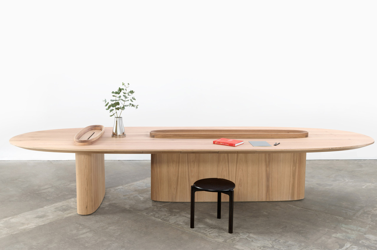
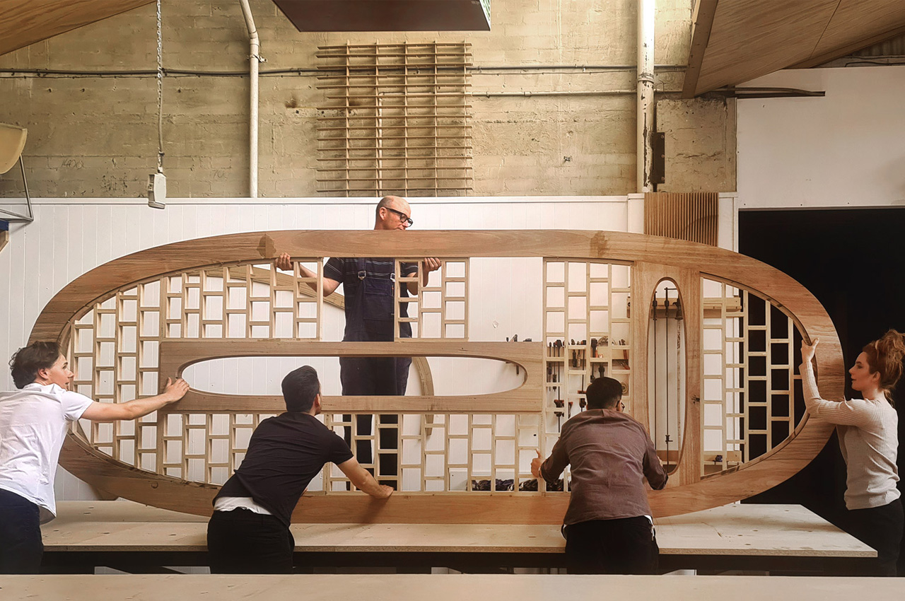
Architecture studio Snøhetta designed a beautiful table crafted from wood sourced from the bottom of a lake called Pieman Lake in Tasmania, Australia. Called the Intersection table, the minimalist table is constructed using Tasmanian oak sourced by Hydrowood – “one of the world’s first underwater forestry companies”.
Why is it noteworthy?
As part of Snøhetta’s ongoing exploration of defining valuable use of new and forgotten material technologies, the worktable is the first exploration into wood aged at the depth of a lake for decades. The table was created by Snøhetta’s Adelaide and Oslo offices and was in fact handmade via traditional woodworking techniques. The tabletop features an impressive torsion box construction, which mimics the wings of an airplane.
What we like
- This torsion box construction supports large cantilevers which provide rigidity and structure
- The Intersection Table boasts a form that is meant to represent “the endless Australian coast”
What we dislike
- A bulky design that occupies a lot of space
4. Wooden Arcade Cabinet
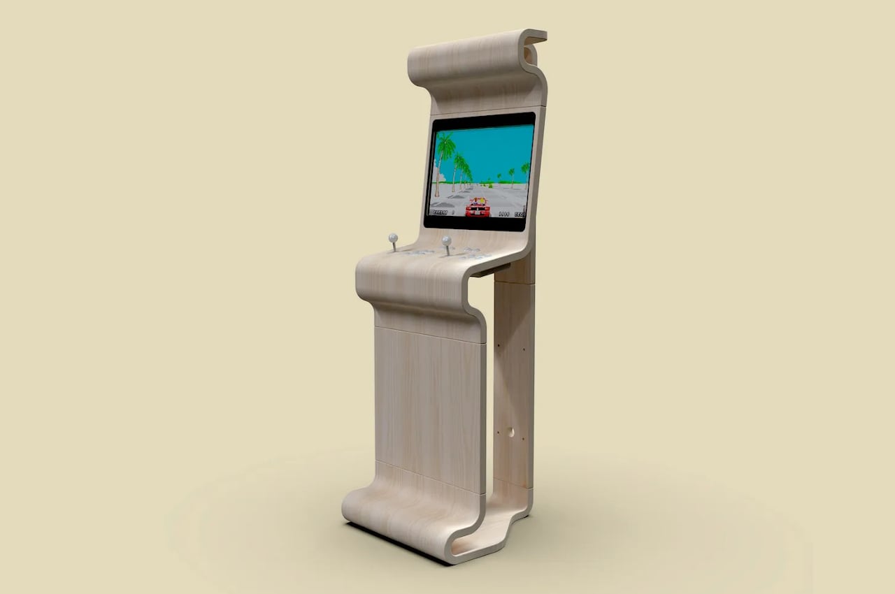
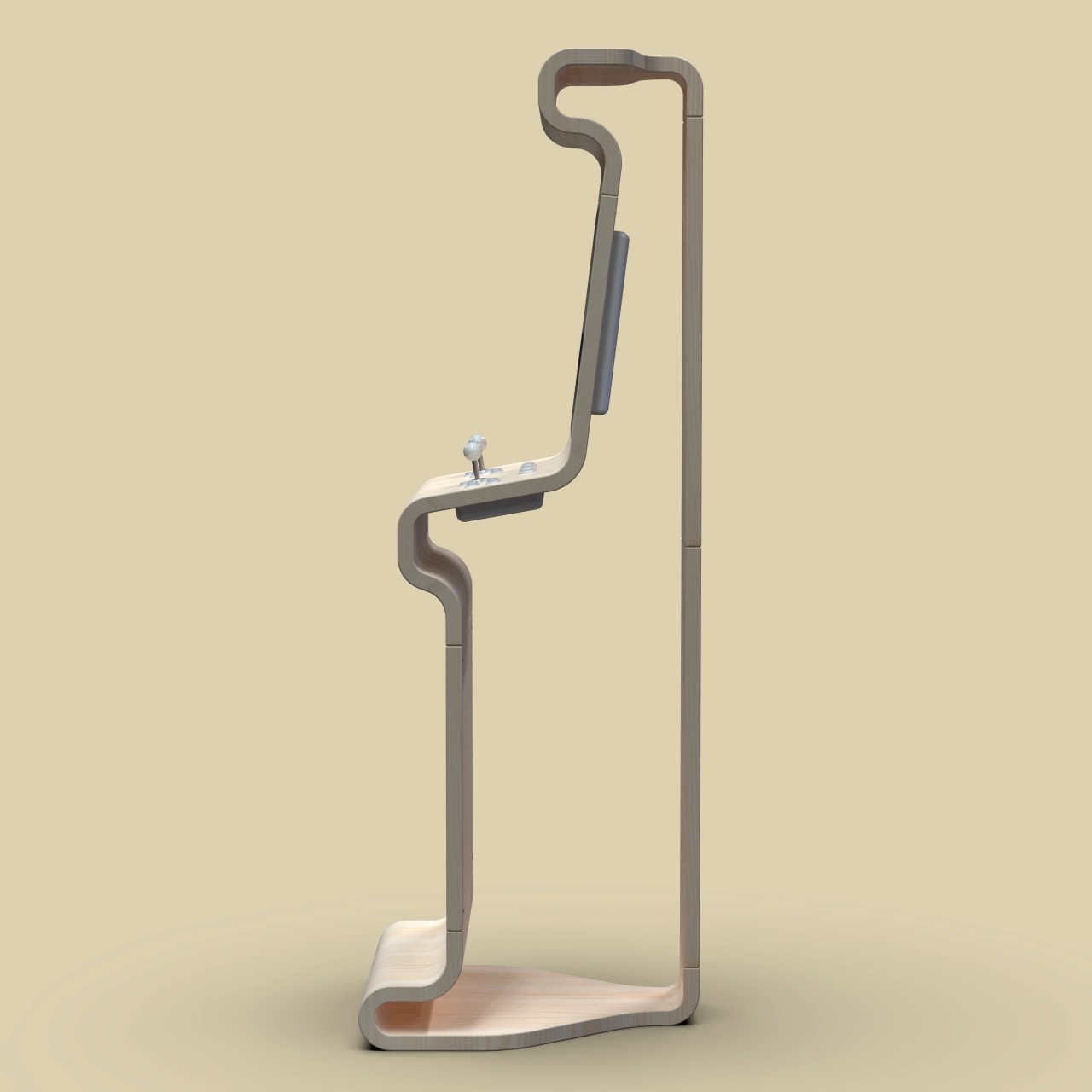
We’ve seen many of these “old school” designs surface in the past few years, thanks to successful “retro mini” revivals of popular consoles from a few decades ago. Of course, not all revivals have to stick to those same old designs, especially when there’s plenty of room to see these old giants in a new light. This arcade cabinet, for example, offers the same functionality as its predecessors but puts it inside a bare, minimalist wooden structure that looks stylish and perfect for a luxurious room.
Why is it noteworthy?
Unlike conventional arcade cabinets, this design can hardly be called a “cabinet” because of its shape. Instead of a large box, this arcade cabinet only has the outer “skin,” showing only the silhouette of the gaming contraption. In fact, it also has its sides left out so that you’ll only see the outline of its profile when seen from the sides. Unlike a typical cabinet as well, this interpretation has its back tapered a bit, streamlining the design and minimizing space.
What we like
- It has plenty of curves that give it a softer personality
- This arcade cabinet almost looks more like an art piece paying homage to the golden age of arcades
What we dislike
5. Sharing Joy
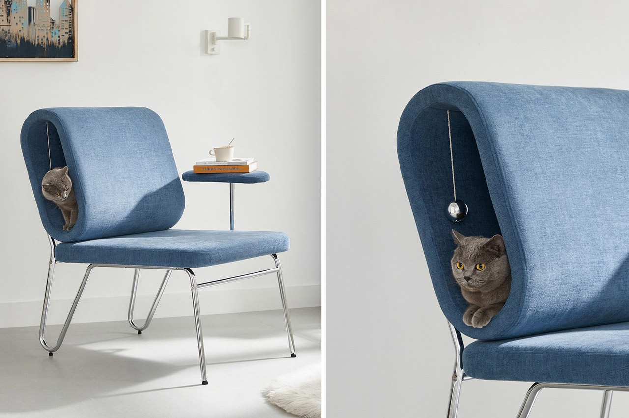
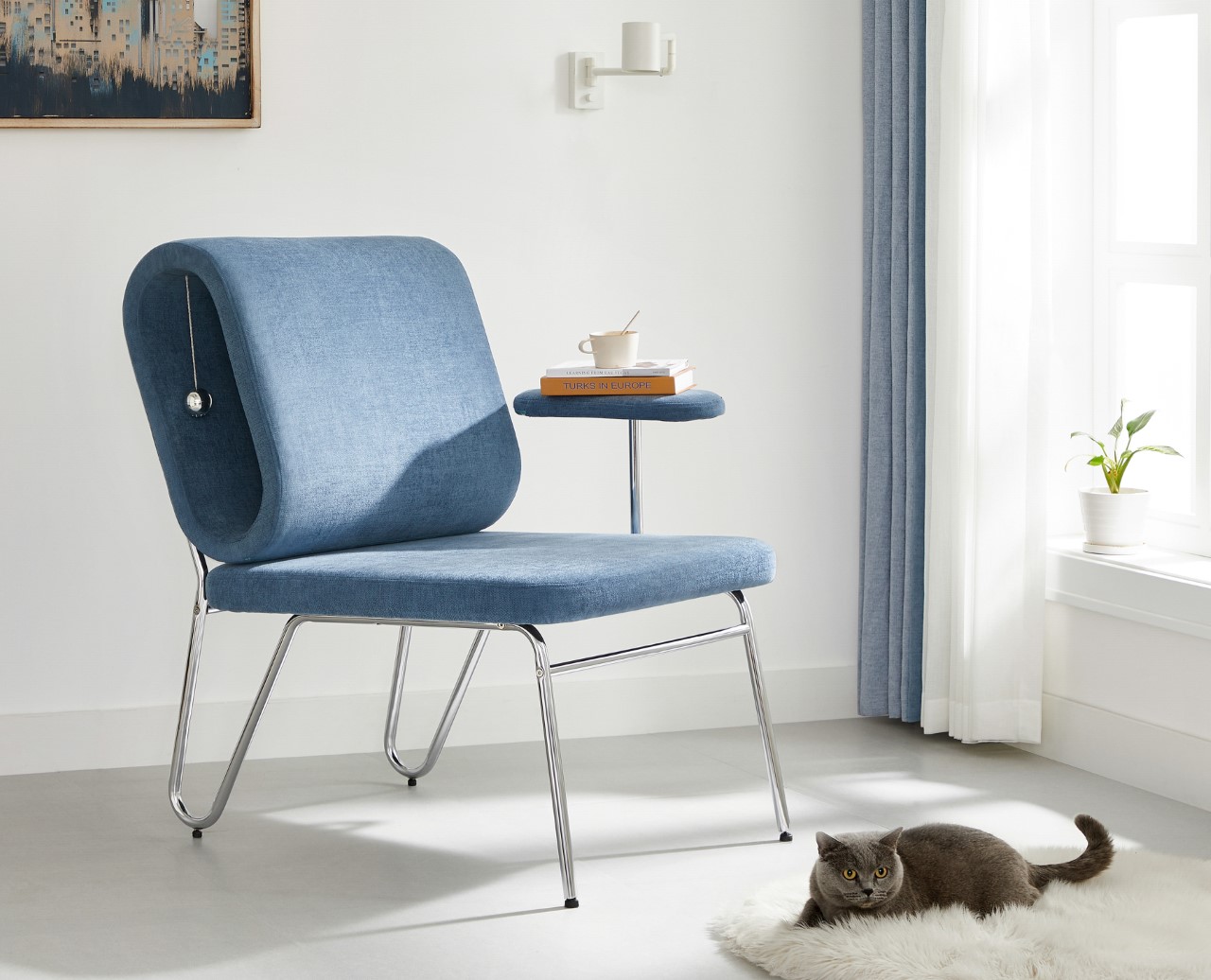
Rather aptly titled ‘Sharing Joy’, this award-winning chair comes with a side table for humans to place their books and cups of tea/coffee on, and a crawl space for cats to casually lounge in (complete with a suspended toy for them to play with).
Why is it noteworthy?
What I personally love about Sharing Joy is that it subscribes to a broader vision of what lounging is and who can ‘lounge’. Designed for humans and cats to cozy up in, the chair comes with a hollow, oblong backrest that’s perfectly sized for an adult cat (or a tiny dog) to crawl into and laze around in. Moreover, the idea of having the human and pet lounging together against each other sounds like absolute perfection. 10/10 will give you the happiness hormones.
What we like
- The chair sports a minimalist aesthetic that fits in most contemporary homes
What we dislike
6. The Plot Twist Bookshelf
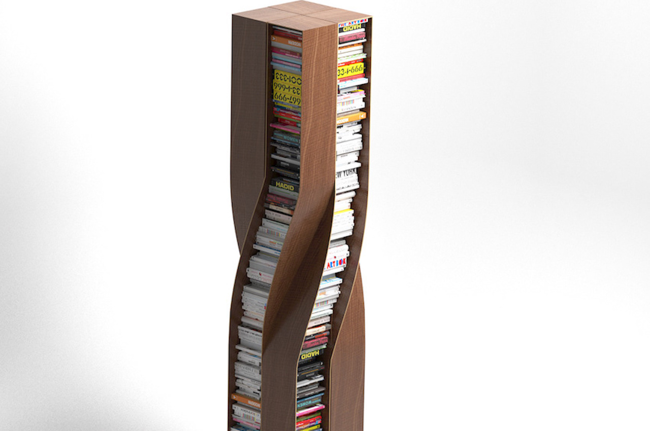
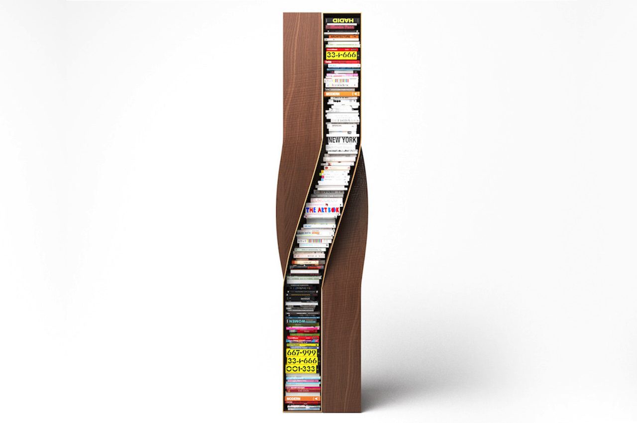
German furniture designer Deniz Aktay always manages to mesmerize us with his unconventional and innovative furniture designs. One of his recent creations is called the Plot Twist Bookshelf, and it features four separate twisted wooden elements. They are connected to each other, shaping and creating a stable form.
Why is it noteworthy?
The bookshelf’s design allows it to be accessed from every side. As with most of Deniz Aktay’s product designs, this bookshelf is oddly satisfying. The curves are present as with the designer’s other projects. In addition, most of Aktay’s works have undergone some bending or twisting, as with the Wavelet, the Tie Stool, and The Pet Table.
What we like
- The shelves can accommodate similarly sized books for a clutter-free look
- The bookshelf is stable and stands on its own
What we dislike
7. Crossbred
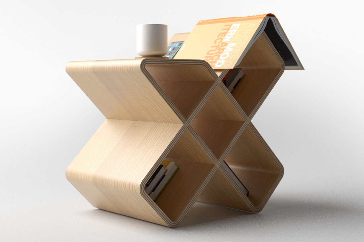
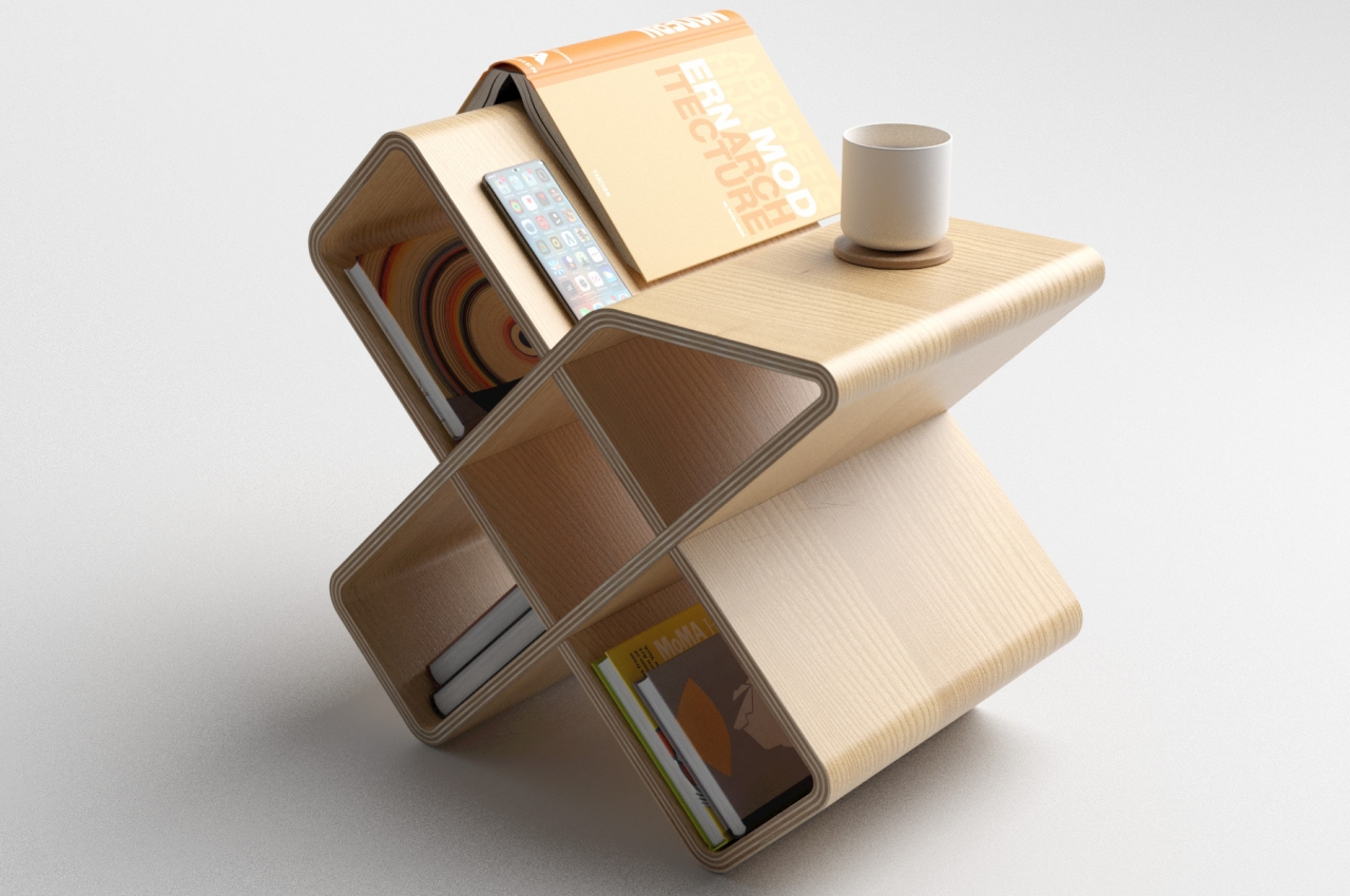
Having something that can serve multiple functions at once is definitely better, and that’s what Crossbred tries to offer on a slightly smaller scale.
Why is it noteworthy?
The furniture’s name speaks to both its form as well as its function. It looks like an “X” or a cross, as some might call it, standing steadily on the tip of its two legs. It’s a hollow cross through and through, and all five spaces can be used to store anything from books to knickknacks. That said, given their inclined surfaces, it obviously isn’t a good idea to put something that requires a perfectly horizontal plane, like some fragile decor or even a picture frame.
What we like
- Multifunctional design
- Perfectly integrates with modern homes
What we dislike
8. The Diag Desk
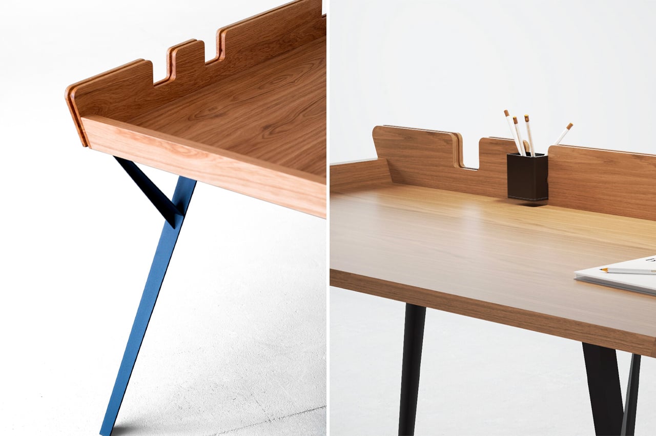
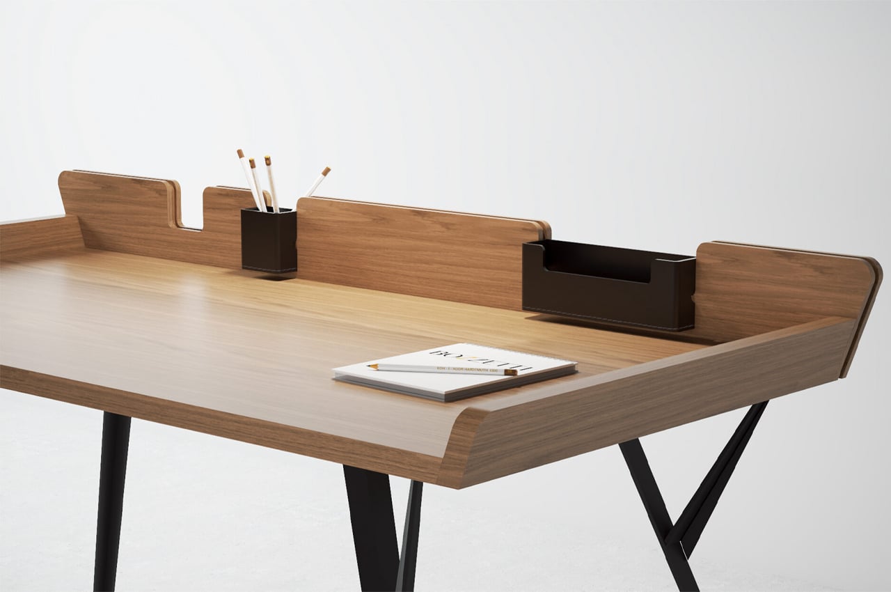
This beautiful, minimal, and modern desk is called the Diag Desk. It’s built to optimize storage space while integrating storage elements such as removable leather compartments. As simple and minimal as the desk is, it doesn’t lack functionality or practicality in any form.
Why is it noteworthy?
Considering its minimalist build, more space can be devoted to the desk’s tabletop, where most of the desk’s purpose is reserved. The Diag Desk from Polish designer Marek Błażucki is one kind of minimalist design that integrates storage systems into its build, ensuring that users have ample desk space while still keeping their necessary stationery within arm’s reach.
What we like
- Integrates ample storage systems into its build
- Ensures stationery doesn’t fall off
What we dislike
- There are a lot of visually similar desks on the market
9. The Linoleum Collection
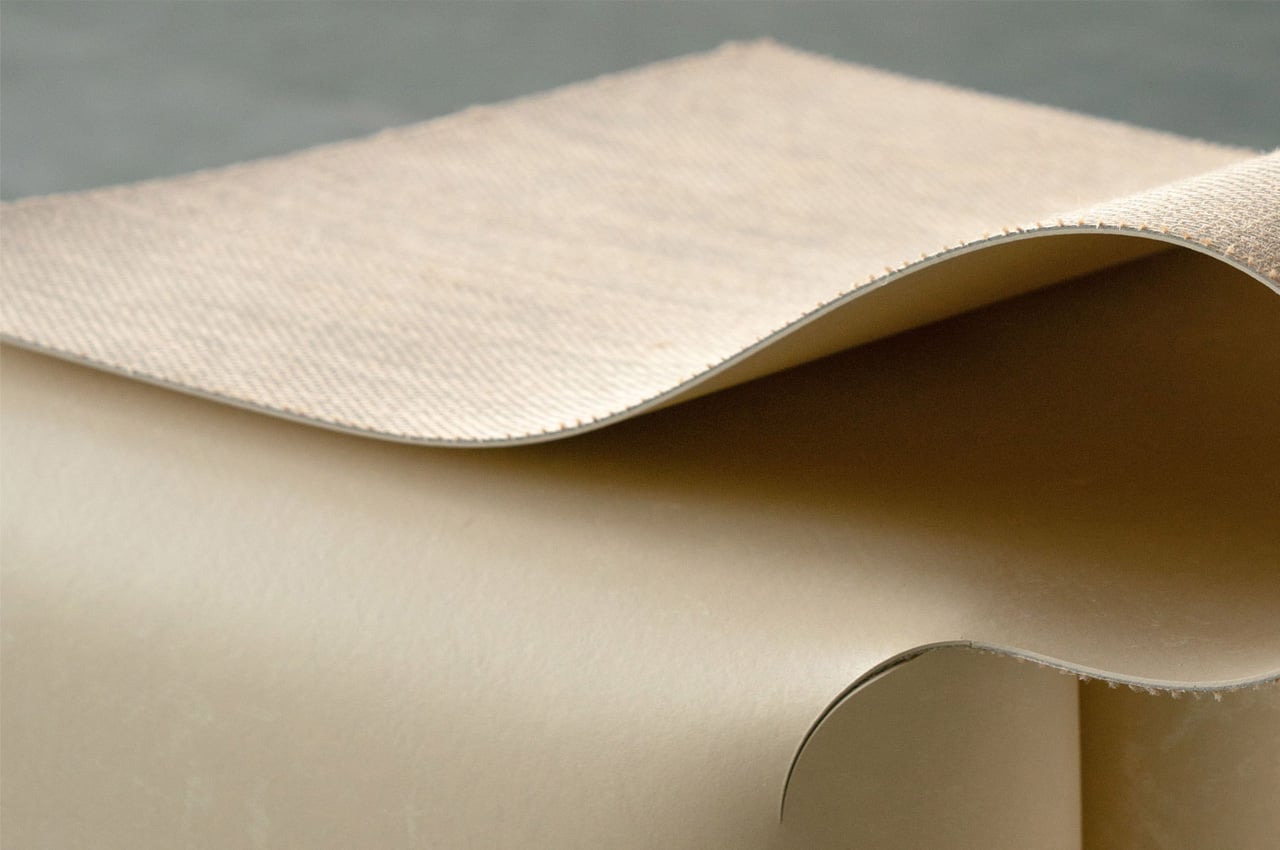
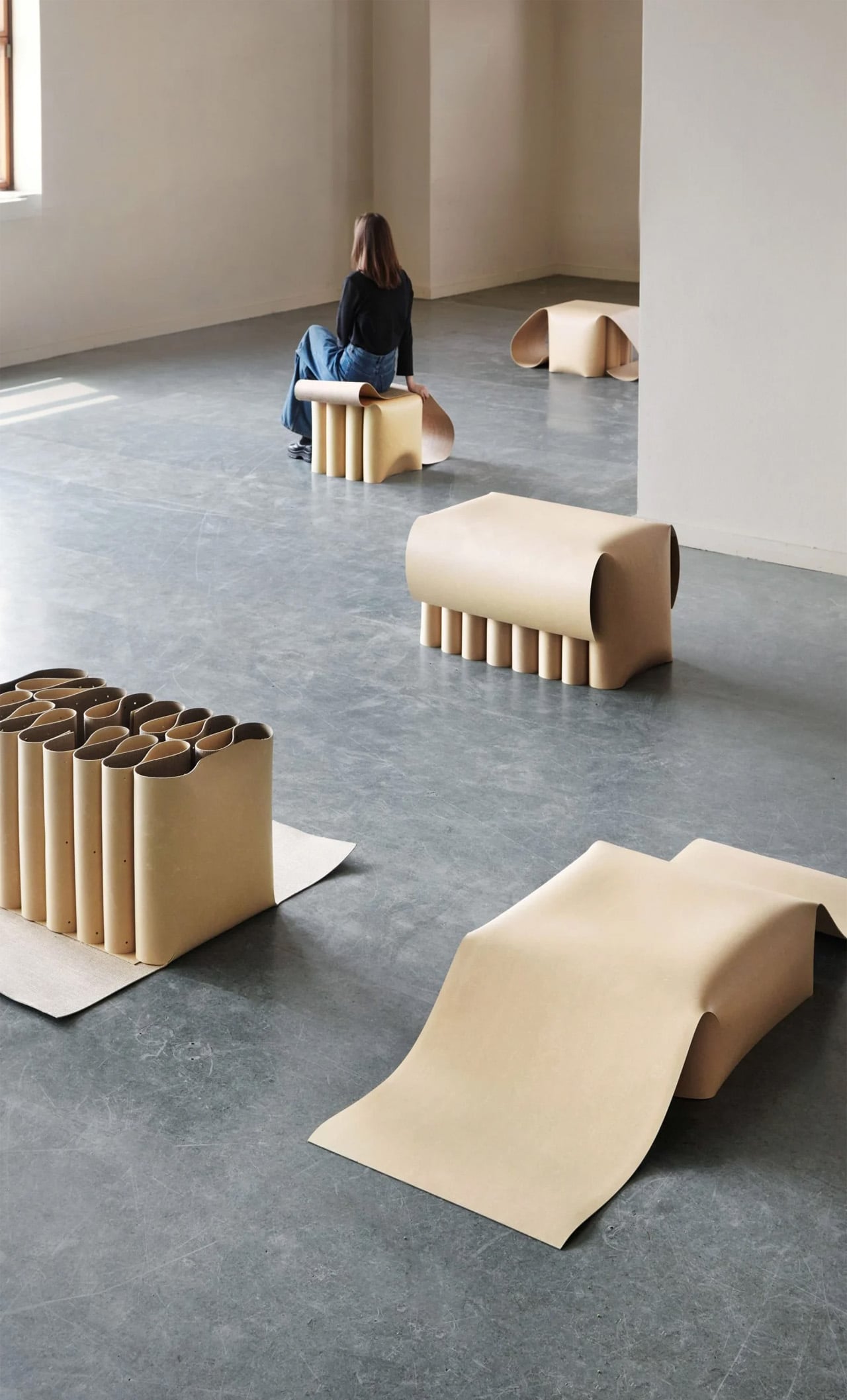
A graduate of Design Academy Eindhoven, Lina Chi decided to revamp the usage of linoleum – by creating a collection of curvy and quirky furniture designs built from single sheets of linoleum. Quite aptly named ‘Linoleum’, Chi hopes to reinvent the material and provide it with a new identity.
Why is it noteworthy?
The Linoleum collection consists of a bench, two stools, and a low table. Linoleum is a material that has been existing for ages. It is primarily used as flooring, although it can be used as furniture. It is a material that is quite common in spaces – such as schools, kitchens, and hospitals but is often mistaken to be plastic since they both have a similar appearance. Chi wanted to rebrand linoleum and present it in a new light.
What we like
- Sculptural + visually pleasing
- Reimagination of a familiar material
What we dislike
- Not everyone may like furniture created from linoleum
10. The Dune
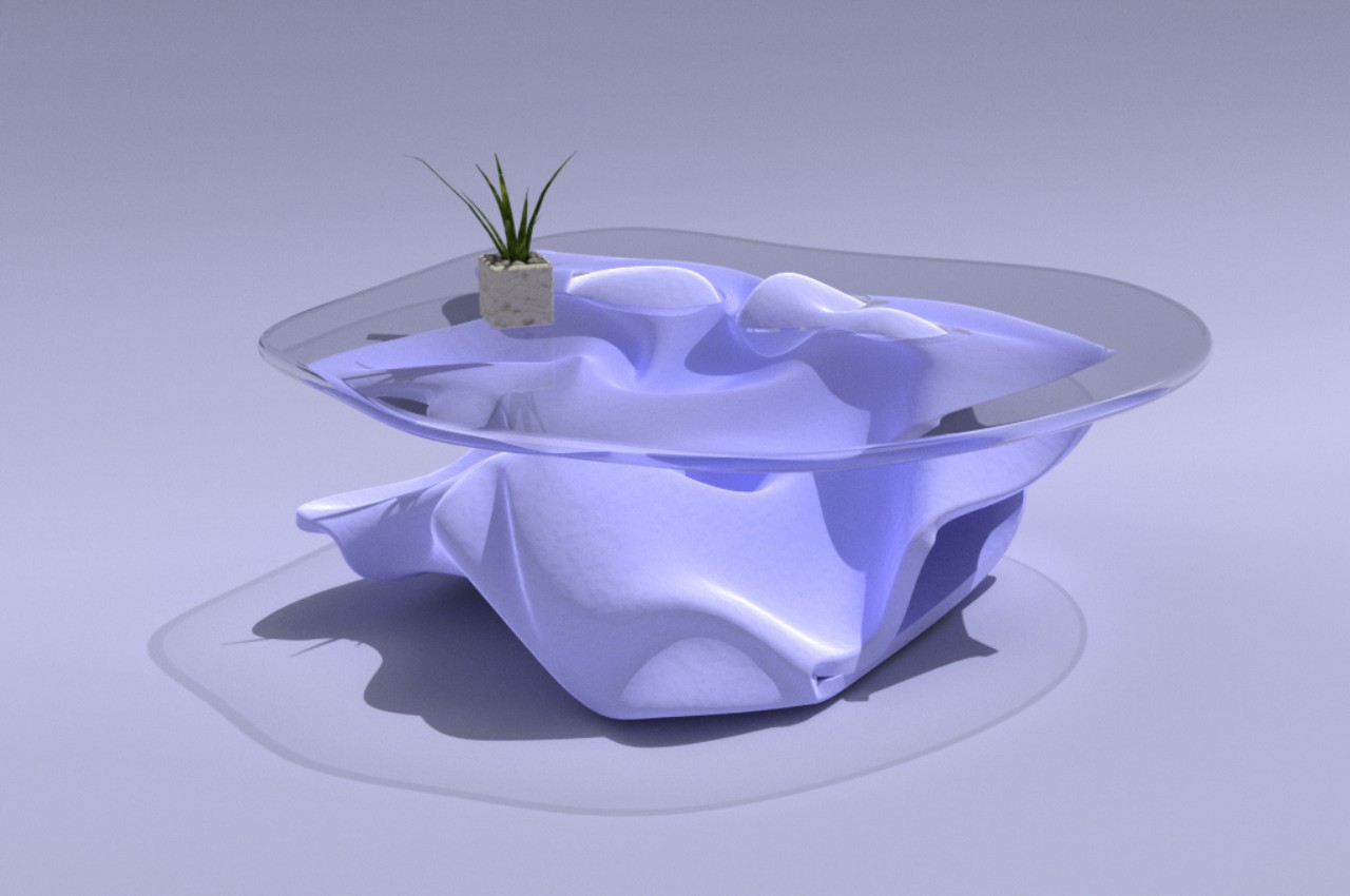
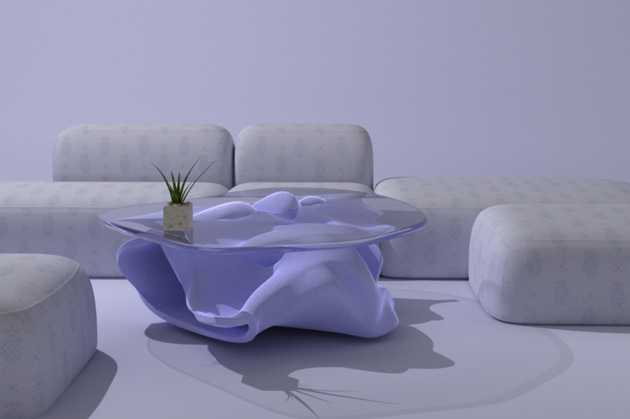
\There is something about loose sand that gives people a peaceful feeling, whether it’s sand on the beach or sand in zen gardens. There is one other location where such sand exists, but not everyone will want to travel to the desert just to enjoy such a view. Fortunately, there are plenty of ways to recreate that imagery at home and this center table concept design is arguably one of the most gorgeous.
Why is it noteworthy?
The Dune table’s name makes clear its inspiration, which might not be immediately apparent simply from its form. Unlike a gently sloping dune, the table’s base rises and falls in an almost random pattern. This creates forms, edges, and corners that wouldn’t be normally possible with natural dunes. Along with its blue hue, however, it gives the table an almost mystical and otherworldly character that only adds to its soothing visual.
What we like
- The tabletop also follows this amorphous design, forming an irregular shape rather than a typical circle or ellipse. It gives a perfect view of the man-made dune underneath, serving both functional and aesthetic duties

