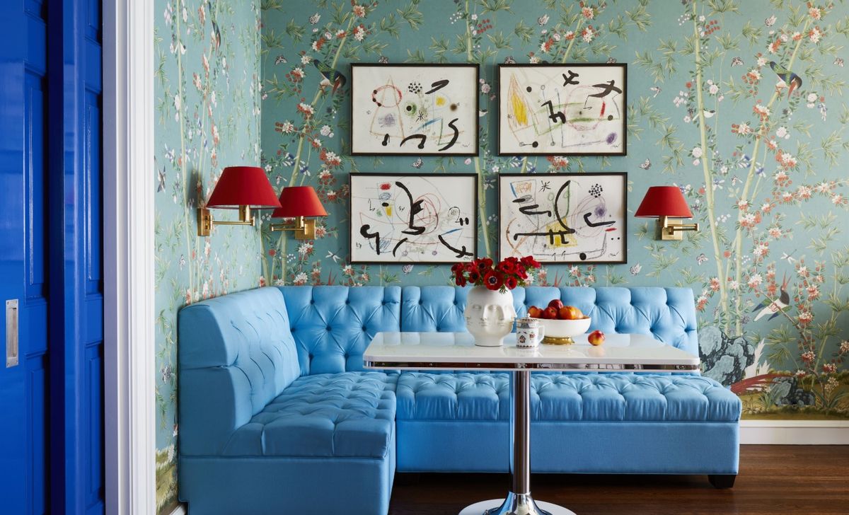
With a little help from artist Philippa Jeffrey and her husband Jonathan, this Grade II-listed 18th-century farmhouse has stepped out of the shadows and into the light. When they bought their country home five years ago it was very dark, with a dull gray and beige décor. But it is fast becoming a latter-day interpretation of Charleston style – the decorative Sussex home of the Bloomsbury Group. Rich, inspiring and uplifting shades and thought-provoking patterns make their marks in every room of the house. Philippa has left no surface untouched.
And the truly unique decorative finishes make this one of the world’s best homes, full of inspirational touches we’d all love to see in our own homes. Here are the highlights.
Entrance hall – a place to linger
(Image credit: Malcolm Menzies)
The spacious entrance hall is a place to linger, with a characterful inglenook fireplace and an inviting mid-century style armchair. The smart geometric print upholstery fabric and rug bring the look right into this century. Hallway ideas and updates like these would work just as well in a newer property as they do in this 18th century farmhouse. The slate flooring was added by the previous owners. In the fireplace are old magazines from Philippa’s days working for a fashion magazine.
Dining space with gallery wall display
(Image credit: Malcolm Menzies)
During the recent lockdown, in between homeschooling the children, Philippa decided to refresh the kitchen scheme, incorporating an unusual new decorative element that literally takes things to a new level. Built into the height of the kitchen is a mezzanine floor, added when the previous owners updated the kitchen. Philippa uses the staircase wall for a gallery display of paintings and prints. An art gallery may not be top of your list of dining room ideas, but any kind of gallery display near a dining table provides a good talking point at mealtimes, and injects personality into a space.
Kitchen with soft pink cabinets
(Image credit: Malcolm Menzies)
The kitchen was a later addition to the house, and Philippa wanted to do everything she could to make it as light and airy as possible. The previous owners had added dark wood beams and black granite worktops, so Philippa and Jonathan’s kitchen ideas included replacing the worktops and painted the beams white – quite an achievement given the height of the ceilings. The kitchen layout was good, and the cabinets, in two tones of beige, were originally from Mark Wilkinson and were far too good to replace. Philippa wanted a fresh new look, and space for a table. And the pink cabinets are her favorite dusty pink shade that she uses a lot in her work, so the color felt like an obvious choice. This pretty room really is proof that you can create a very different look simply by applying a coat of paint in a fresh new shade.
Bedroom – an oasis of calm… and pattern
(Image credit: Malcolm Menzies)
Above the pretty inlaid bedside cabinet from Graham & Green is one of Philippa’s paintings, one of the subtle changes that has given the room a real lift. Other bedroom ideas here, that are well worth copying, are to layer and combine bedlinen from different brands – nothing too matchy matchy. So vintage-style bedlinen is topped with a boho throw, with a stripy pillowcase and a vintage lace cushion.
Child’s bedroom is pretty in pink
(Image credit: Malcolm Menzies)
One of the most recent updates upstairs is in the children’s guest room. It was a lockdown project so as yet not many young guests have had chance to sleep over here. The couple worked on the room together, with Jonathan wallpapering all four walls and the ceiling to create a cosy, cocooning space. The wallpaper is Love Leaves from Common Room.
Philippa added accessories and furnishings in her favourite shades – many pieces are antique or vintage finds. Philippa made the lampshade herself, and the vintage patchwork quilt was made by her mother-in-law
Powder room beauty
(Image credit: Malcolm Menzies)
The downstairs powder room is full of inspiration that would work just as well as bathroom ideas for main bathrooms. The washstand is from a vintage store and the couple sourced the marble and round bowl online then added Moroccan taps from an Etsy trader. The fabric was also found on Etsy
The old farmhouse exterior view
(Image credit: Malcolm Menzies)
It’s not just the interiors that have been updated. Every single window in the house had to be replaced as the old ones were rotten, causing heat loss and condensation. These are wooden heritage-style replacements. All of the house’s stonework has also been repointed using traditional methods and, much to everyone’s delight, the wisteria was preserved.
This has been a thorough and inspired renovation – inside and out – that has brought life and much-needed color back to the old farmhouse.

